
June 17, 2014
There’s nothing better than creating a beautifully designed business card that perfectly represents what your brand is all about. They can come in a variety of shapes, sizes, textures, and treatments. What you choose as your business card says a lot about the type of business you have.
Some people like to go out of the box a little and make some pretty creative business cards for themselves, where as others like to keep things clean, crisp, and professional with a traditional looking business card.
Here are a few examples of some business cards that we think are quite eye-catching and make a great first impression.
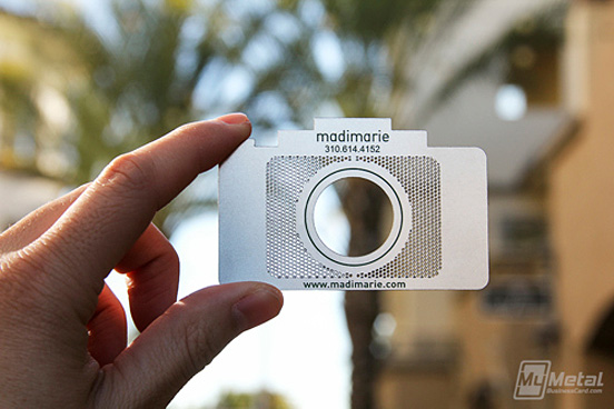
This cut-out trendy card is a great idea for a photographer. Using the card to replicate a camera, complete with a view finder, is a fun-creative way to express your personality; while being completely unique to most of your competitors. This specific design even went as far as used metal instead of printing on paper card stock. The printing cost of a card like this could be more expensive than your typical card, but your business will surely be remembered with a card like this one.

Simple and easy changes to a business card can really make a difference to the look and feel of your business card. With rounded corners and a matte finish, you can give the impression of a higher-end custom card design with minimal additonal costs to your printing.

Some people say that QR codes are a dying fad that won’t be seen much in the near future. Others swear by them and find them highly useful for their marketing and advertising campaigns. In my opinion, it all depends on their intended use. Adding a QR code that links to special video or message to whomever scans the code could be a great way engage with your future clients that leaves quite a lasting impression.

Similar to the idea of the photographer card seen above; this card design leaves no questions as to what kind of business they run. What I find most fun about this design is when all the cards are still stacked together, they appear to be a full loaf of bread.

Embossing or Debossing are great treatments to add to cards; when done properly. Most people choose to use this type of treatment on just the logo or text of a card. This design chose to use this technique as a bite imprint for a dentist office. I applaud the risky use of this treatment in such a non-traditional way. BRAVO!

Last, but certainly not least… the UV Coating treatment. This is one of my personal favourite ways to take a boring card design and make it timeless, classy, and sophisticated, with little cost to your printing budget. It can be used on all types of cards (colour, black and white, and in some cases… all white/black cards). Using this treatment for special text or logos in the background of a design and add a whole new dimension to your business card without making it look cluttered.
Let us know which is your favourite look in the comment section below!
Every time I’m designing a new card, I always think about this clip from the movie “American Psycho”. I find it hilarious to see the how hard-core these guys are with their card designs.
P.S. If you are interested in getting some new business cards printed for you and your company, contact us today for a free quote and design consultation. We’d love to hear your ideas and bring them to life!
Categorized in: Business Cards, Graphic Design, Printing


Comments are closed here.